Color Correction Isn’t Optional Anymore (Here’s How We Handle It in Our Studio)
There’s one thing that can make a professional photo feel cheap almost instantly.
Bad color.
Skin tones too orange.
Blues that don’t look blue.
Greens shifting weird.
Backgrounds changing color from image to image.
One setup looking warm and another looking cold.
Most people can’t explain why a photo feels “off,” but they can feel it immediately.
That’s why color correction has become one of the biggest parts of our workflow — especially as our business has grown into volume photography, commercial work, sports, seniors, and headshots.
When you’re photographing hundreds or thousands of people across multiple jobs, consistency matters.
And honestly?
Color correction is one of those behind-the-scenes things clients may never notice when it’s done right… but they definitely notice when it’s done wrong.
The Tool That Changed Everything For Us
One of the biggest tools we use in our workflow is the ColorChecker.
In the video, you’ll actually see me grab it right before we start shooting Bethany’s headshots.
I always try to get a clean ColorChecker reference shot once my lighting is fully dialed in.
Why?
Because lighting changes everything.
Even small changes.
If I move a modifier…
Change the power…
Bring the light closer…
Swap modifiers…
Change bounce or spill…
Or slightly shift the background…
The color can shift too.
That’s why after I got the lighting exactly where I wanted it, I stopped and did another color card reading.
That second reading matters.
A lot.
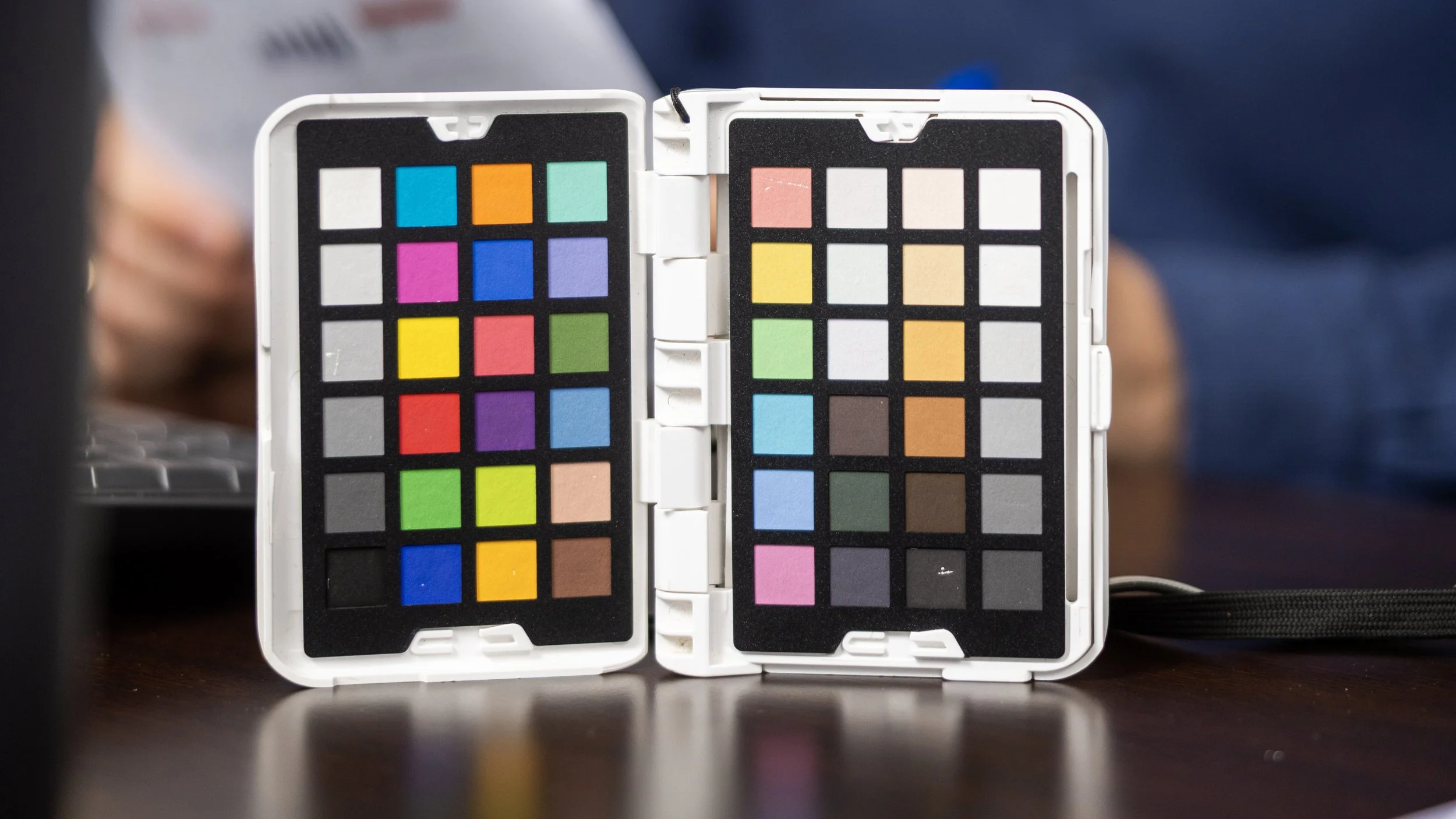
What the ColorChecker Actually Does
For photographers who may not know, a ColorChecker gives your editing software a true color reference.
It helps you make sure:
Skin tones stay accurate
Whites stay neutral
Blacks don’t shift weird
Clothing colors stay true
Different cameras and lenses match better
Multiple lighting setups stay consistent
Because when you’re editing hundreds of images or grading video footage, having a clean color reference saves a TON of time.
Instead of guessing, you start from a calibrated baseline.
That speeds everything up.
Why This Matters More In Professional Work
If you’re just posting casual photos online, color might not seem like a huge deal.
But once businesses start paying you?
Everything changes.
A banker’s suit has to look correct.
A company’s brand colors need to match.
Skin tones need to feel natural.
Marketing departments notice this stuff immediately.
Especially in commercial photography and headshots.
If someone’s LinkedIn profile photo looks orange or inconsistent with their website branding, it reflects on the business.
That’s why I spend extra time getting it right in camera before I ever touch editing.
My Current Color Workflow
Right now, our workflow is pretty straightforward:
In Camera
Canon R5
Canon RF 28-70mm f/2
Westcott FJ400 lights
Manual white balance workflow
ColorChecker reference shot
Controlled studio lighting
During Editing
We use:
Adobe Lightroom
Photoshop
Evolve Edits for large-volume correction workflows
Custom presets as starting points
ColorChecker calibration when needed
For volume photography especially, consistency is king.
If you photograph 500 students, parents expect those skin tones and colors to look consistent across the board.
That’s where systems matter.
Good Lighting Makes Color Correction Easier
One thing newer photographers sometimes miss is this:
Color correction starts before editing.
It starts with lighting.
That’s why in the video I spent so much time adjusting:
Light distance
Spill
Modifier placement
Background separation
Power ratios
Because cleaner light creates cleaner color.
The more controlled your lighting is, the less work you have to do later.
That’s also why I love studio photography.
Once everything is dialed in, it becomes repeatable.
The Goal Isn’t “Perfect.” It’s Consistent.
I think a lot of photographers chase perfect color.
But honestly, consistency matters more.
If your images consistently look clean, natural, and true to life, clients trust your work.
That trust is huge.
Especially when businesses are using your images for:
Websites
Ads
LinkedIn
Print marketing
Social media
Billboards
Internal branding
The goal is making sure your client looks like the best version of themselves — not a completely different person.
Final Thoughts
Color correction probably isn’t the flashy side of photography.
It’s not the viral BTS reel.
It’s not the dramatic lighting setup.
It’s not the gear everybody talks about.
But it’s one of the things that quietly separates professional work from amateur work.
And honestly, once you start taking it seriously, everything in your workflow starts getting better.
Cleaner edits.
Faster turnaround times.
More consistent galleries.
Happier clients.
That’s why we pay attention to it on every shoot — even something as simple as a headshot session.
Because the little details matter.